Anatomy of rebranding Simple Simon’s Pizza
30 Years
Following its 30th anniversary of operating almost 200 stores in 10 states, pizza franchisor Simple Simon’s Pizza began construction of a new corporate office in the Tulsa, OK suburb of Glenpool. Owners BJ and Becky DuMond recognized this transition as the perfect opportunity to rebrand, for both corporate and franchise applications. Following considerable discussion and debate, the process began with some strict caveats: 1) the new logo must maintain the essence of the original. 2) the new logo must keep the “pizza S”. 3) the new logo should keep the original “chef’s hat” shape if possible. We accepted the challenge.
Research
We had been working with Simple Simon’s Pizza for around four years prior to the rebranding project, so we felt we had a good handle on their perfect customer. But with the crowded pizza market, we wanted to look deeper and get a better idea of what our competition was doing, not doing and where we could shine. Also the ongoing remodeling of the franchises locations played a role in the flavor of the new brand. The first step was to take Simple Simon’s through our Branding Evaluation to find their strengths, their weaknesses and where we could improve.
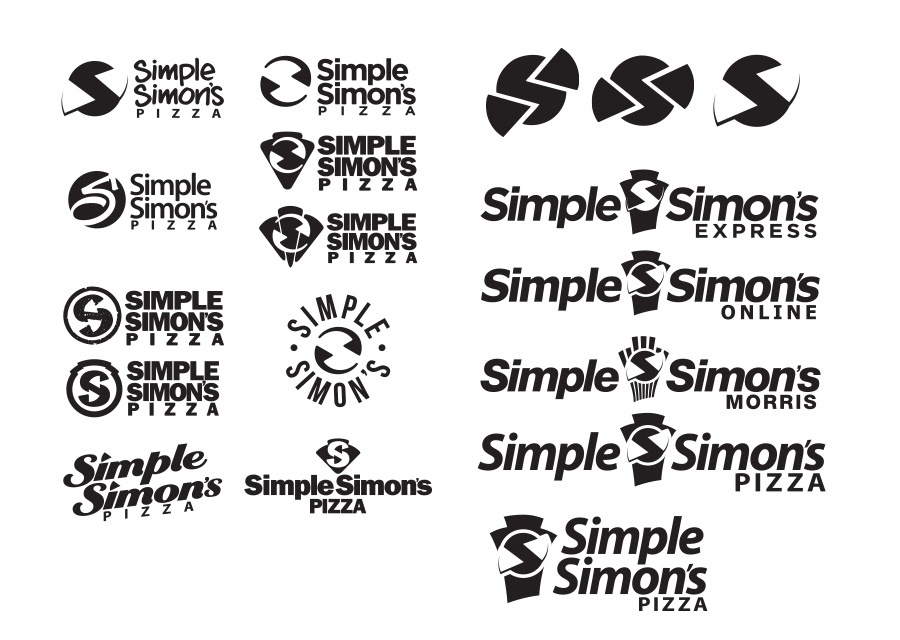
Initial Concepts
Our extensive thumbnail sketches, and rough comps produced a good variety of concepts, a few rose to the top. We culled the field to the best six concepts and presented them to Simple Simon’s. Concept explorations lasted a good amount of time and produced even more results. We narrowed the choice down to concepts that best conveyed the new energy and style the owners wanted to telegraph.
Not My Type
One of the hurdles we ran into was font choice. There were some of the characters in the chosen font that the principals didn’t like. We looked for alternates and other solutions. Nothing quite fit. When we found a font that fixed the problem character, another character would cause trouble. The only choice we had was to splice multiple fonts together or design a new font. For the sake of the budget and the deadline, we chose to splice multiple fonts to get the desired look.
Color Choices
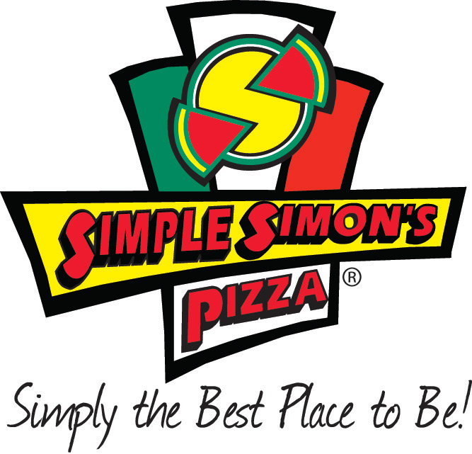
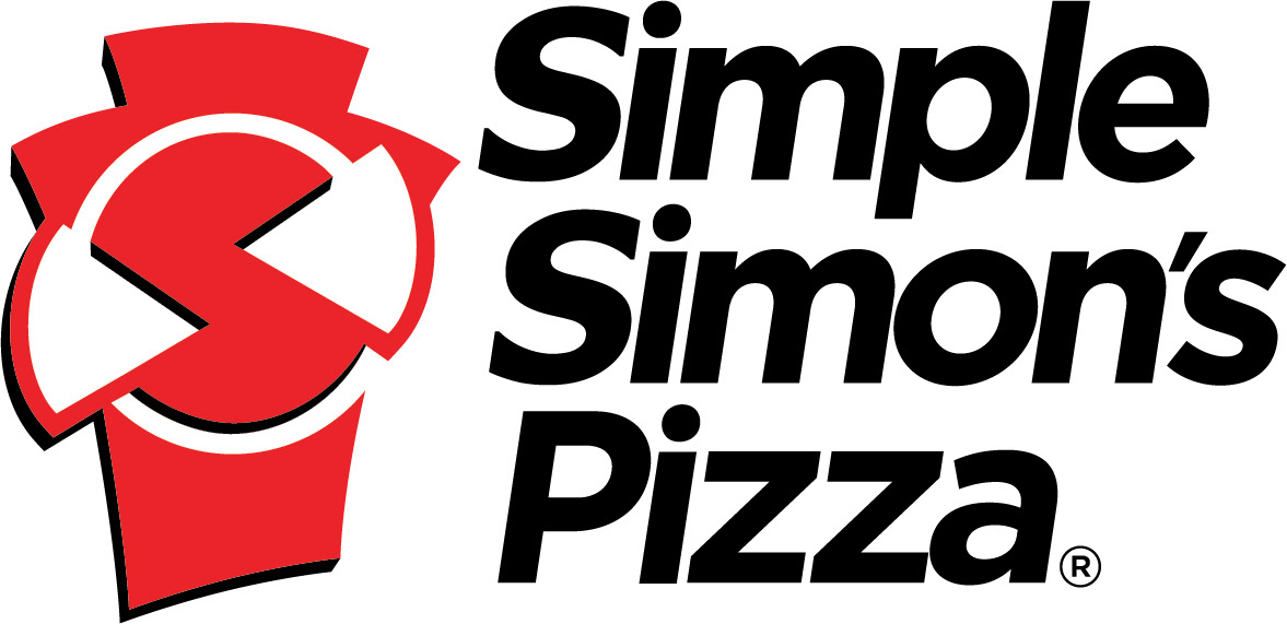
The number of colors in the original logo had caused some trouble in the past. We stressed simplicity and ease of reproduction and narrowed the color palate down to black and their classic red. This has opened up many new options for a secondary palate the company couldn’t access before.
We are very happy with the results, so is Simple Simon’s and their franchisees.
“Mark has provided graphic services for me for over 20 years. I have always appreciated Mark’s rare combination of artistic sensibility and business acumen. He understands that our projects can involve not only a range of creative demands, but also a variety of other critical elements including time, budget, scope, personalities, & the like. I can always count on Mark to deliver fantastic creative in a timely manner no matter what, and within budget. I would not hesitate to recommend him to anyone looking for the same. In short, “He gets it”.“
– Rhett Brooks – Marketing Manager, Simple Simon’s Pizza – Tulsa, OK
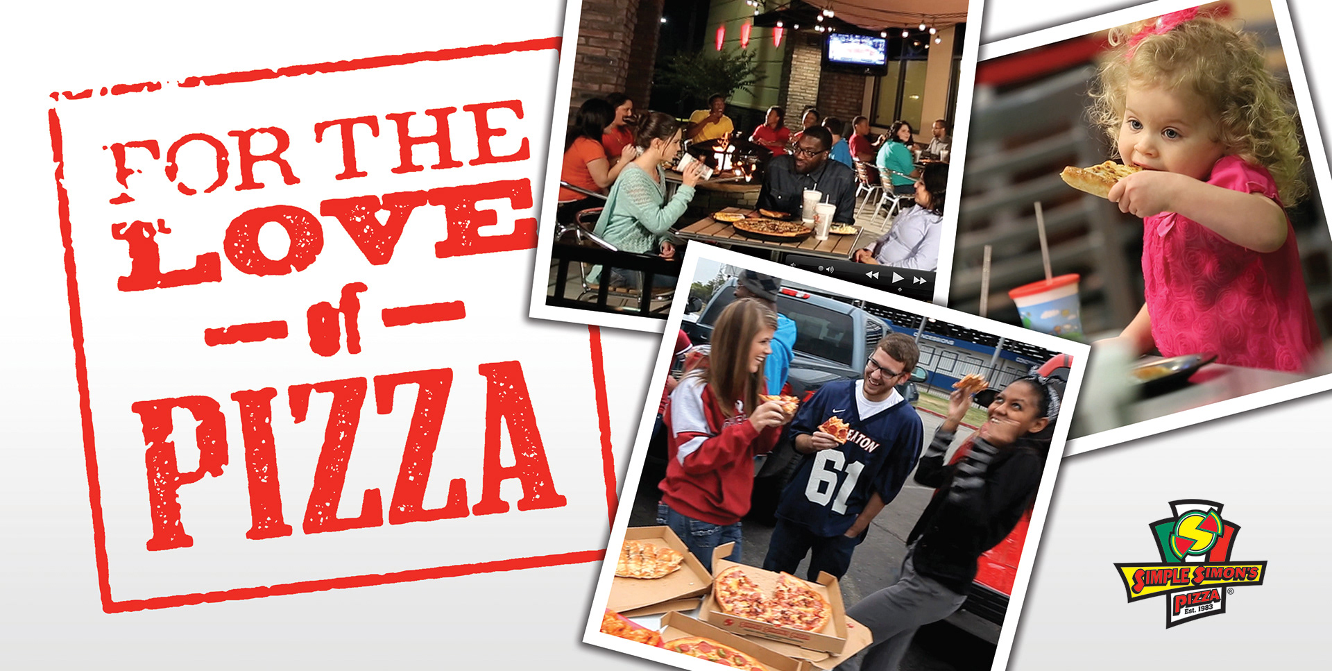
For the Love Pizza Promotion Banner
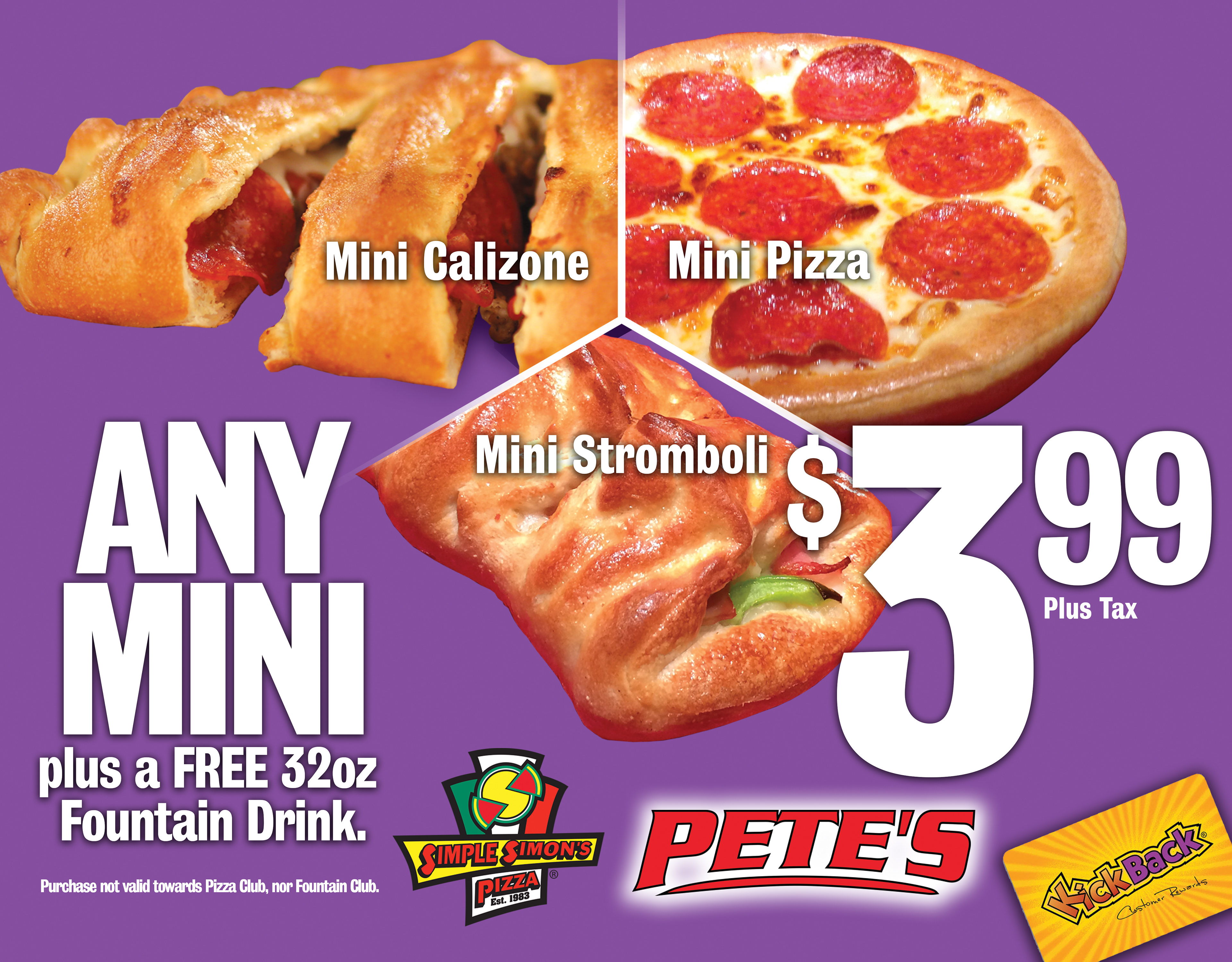
C Store Promotion
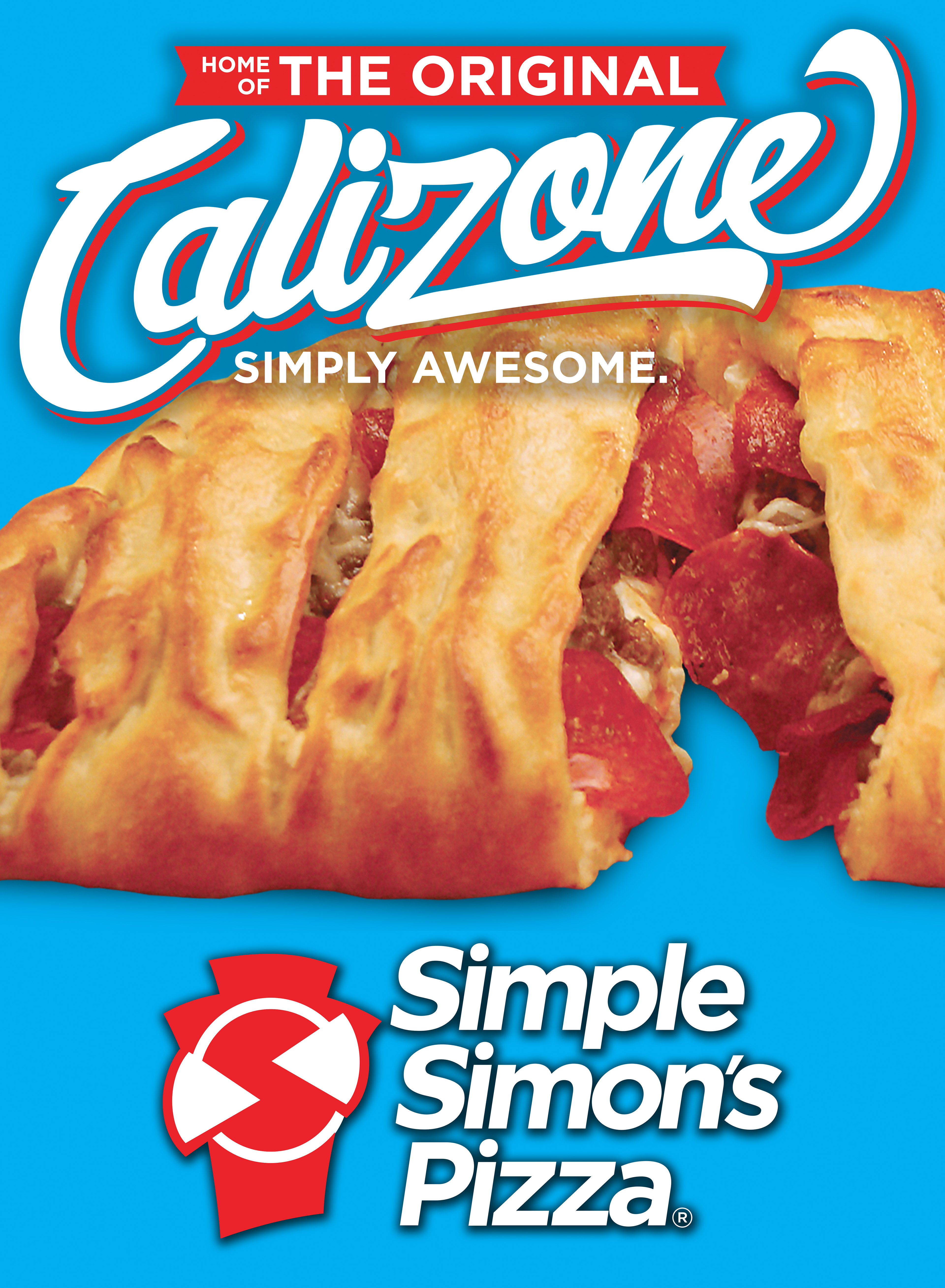
Calizone Promotion Graphic
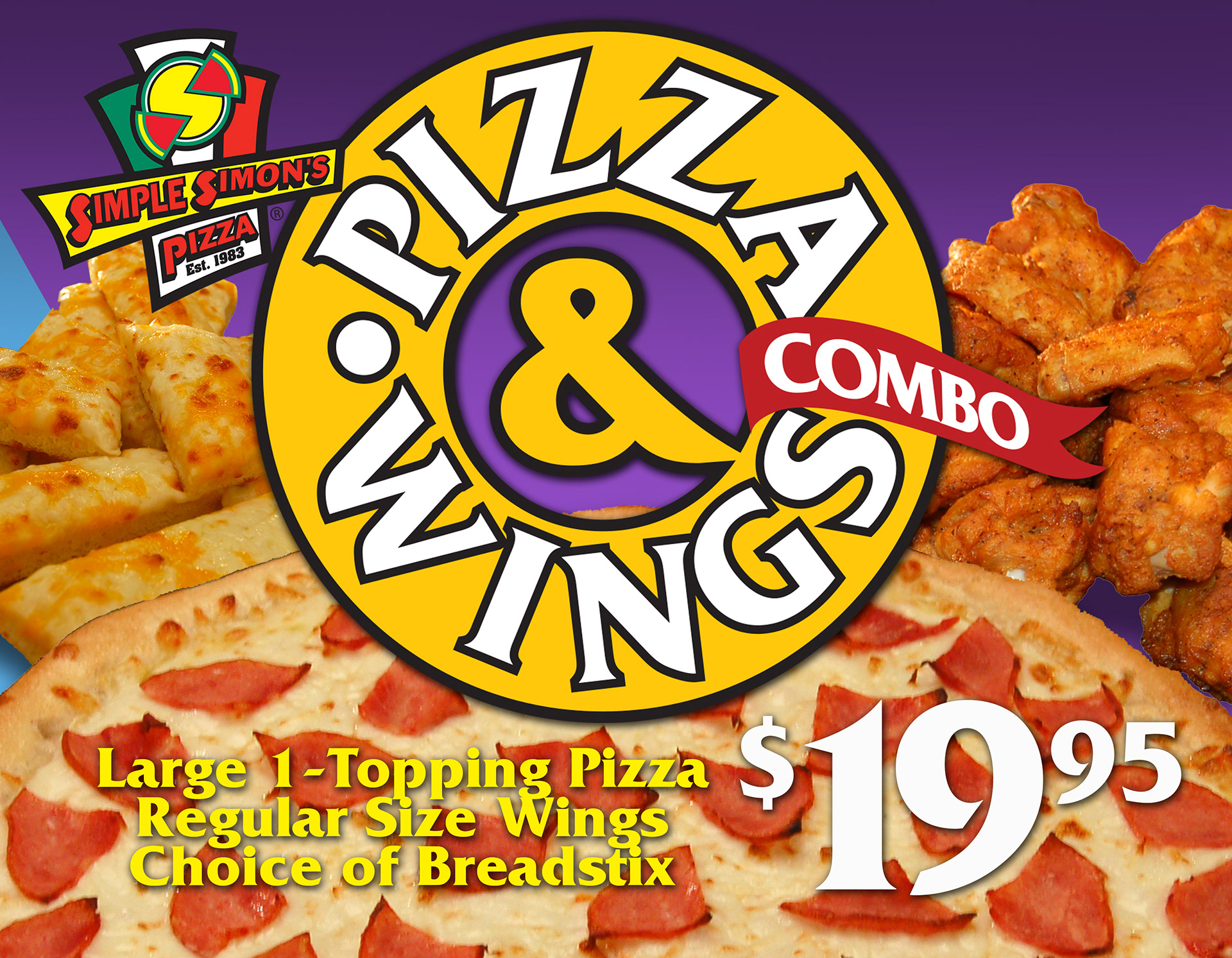
Pizza & Wings Promotion Graphics
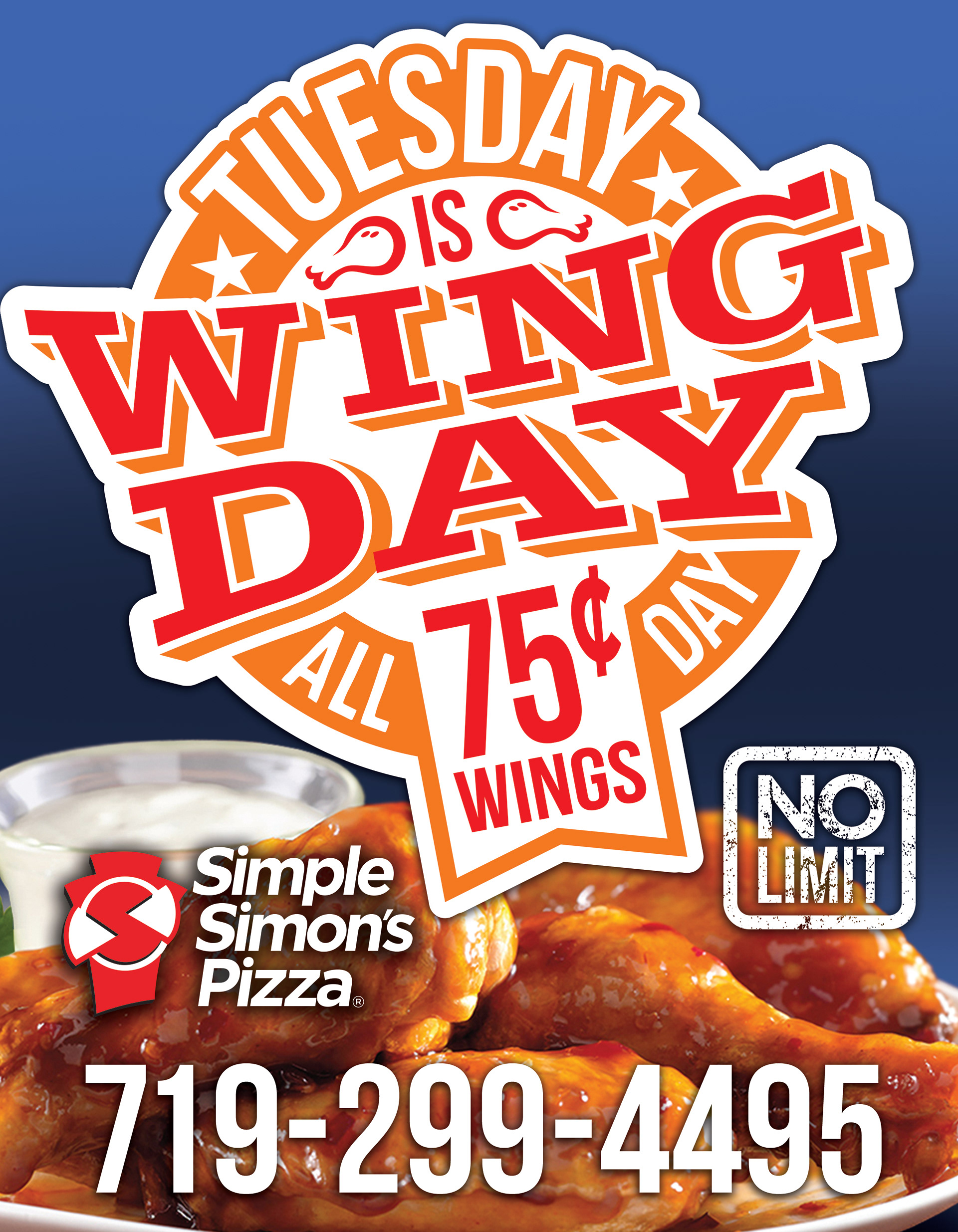
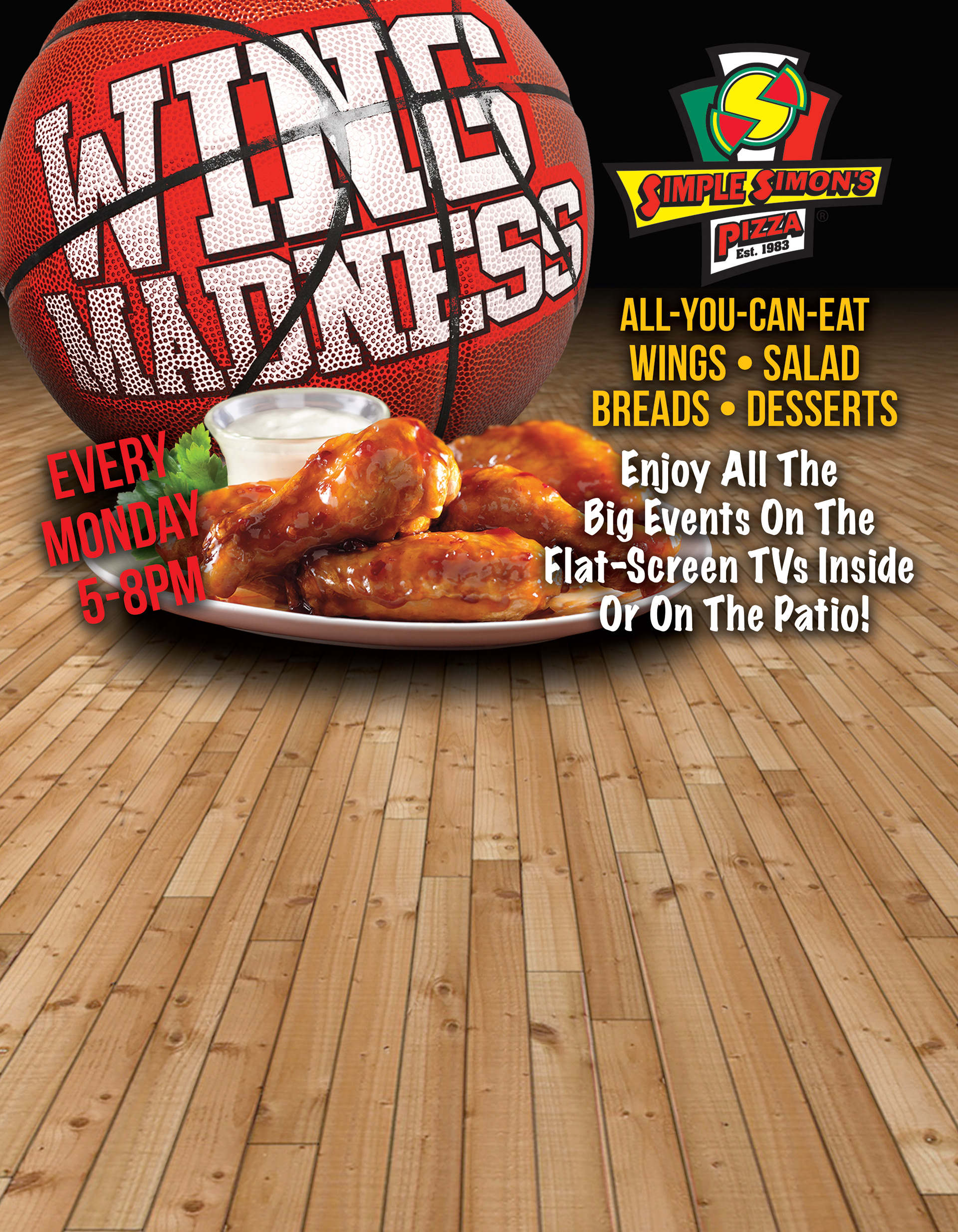
Wing Day Promotion Graphics
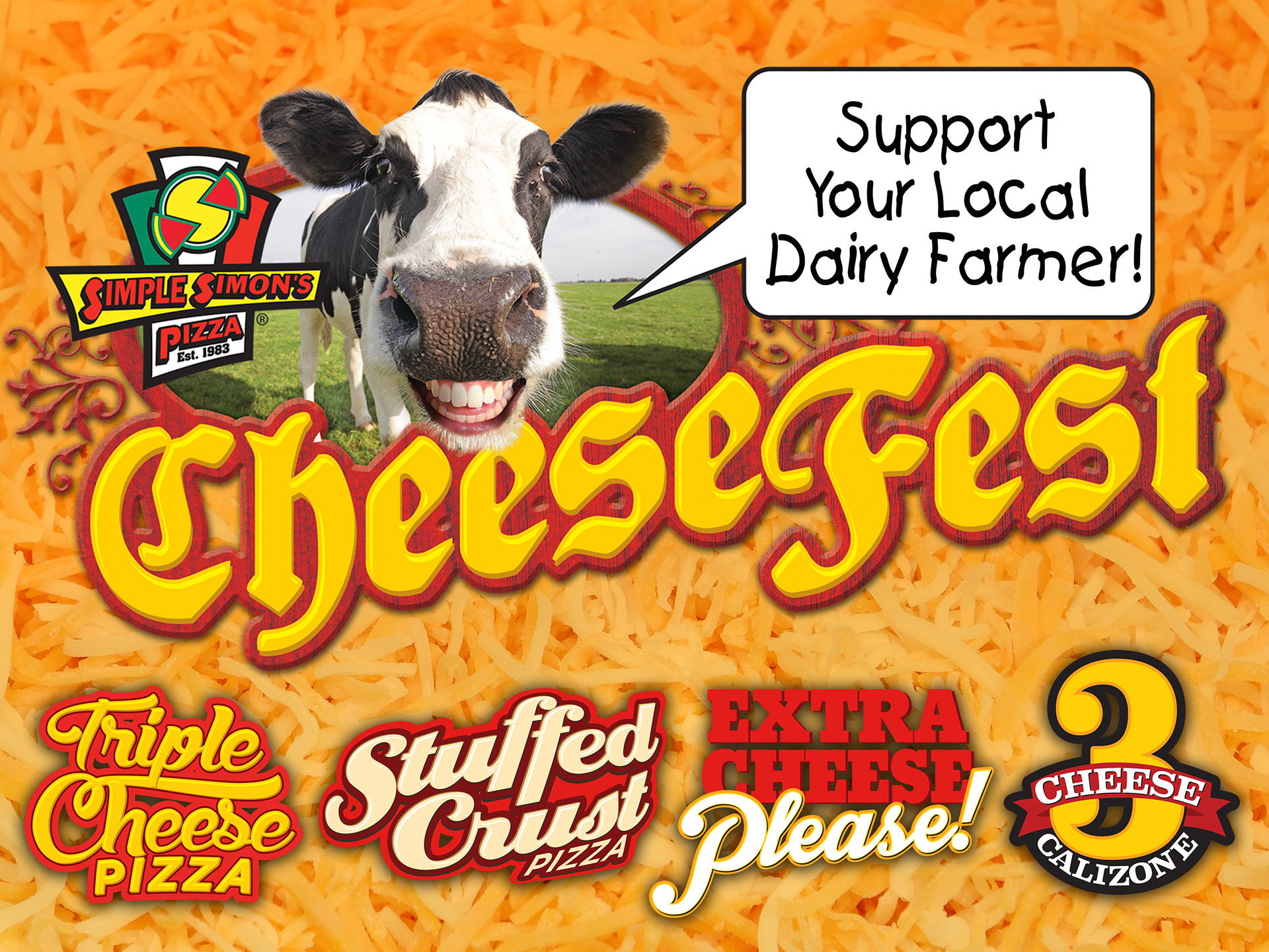
Annual CheeseFest Promotion Graphics