Better Brand. Bigger Horizons. Rebranding Netgate

Blue Sky
With their eye on propelling Netgate® to the next level, owners Jaime and Jim Thompson gathered a team of experts to rebrand their open source network security company. We were honored to be on the team along with Neal Hartsell from Mile 1 Marketing. The vision was to double the market share of Netgate and their wildly popular product pfSense.
Research
Mile 1 Marketing had already done the lion’s share of the research, with in-depth interviews with the principal players, market research, some focus group testing, and name recognition surveys. I was truly impressed with the amount and depth of information Neal provided me to initiate the logo development and visual branding of this network security leader. Once through the stack of information provided, it was easy to envision the array of possibilities of their future brand. (Thanks Neal)
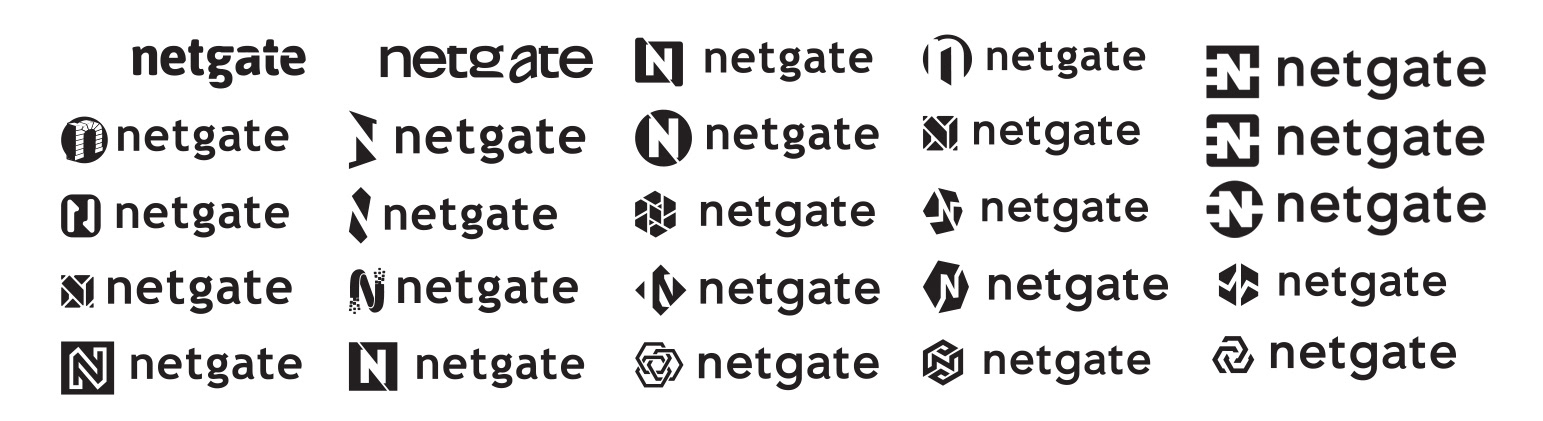
Initial Concepts
We started out with a limited number of concepts just to get an idea of the direction the Netgate team wanted to pursue. That handful of ideas quickly grew to a few dozen concepts presented, each with small variations and tweaks. We had many energetic exchanges forging what soon became the obvious choice. I am proud of the depth we went to in order to capture the look that served the company as well as the owners.
Type & Cross
Early in the process we gravitated toward a font (Trebuchet MS) and stayed with it for some time. I liked many of the features of it, including the lower case “g”. Then an unexpected request came from the Netgate team. “Can we see the logo with Avenir?” A font I hadn’t considered, but looking back, it was a great change and I am happy we found it. After a few tweaks and some customization, Avenir has become the Netgate font.
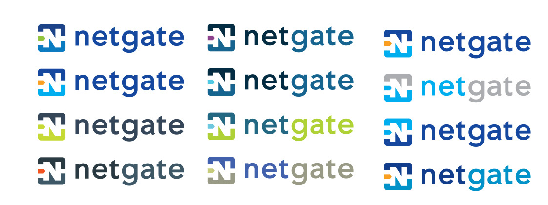
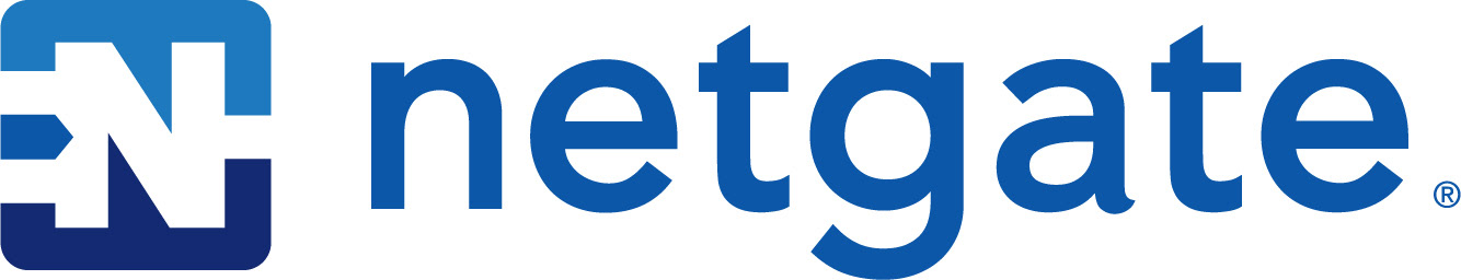
Color Choices
The Netgate team always wanted to keep the color scheme in the blue range. The original logo had been blue, but apart from that the blue hues evoke trust and dependabilaty. If Netgate was anything, they are dependable. The obvious next question is “Blue plus what?” We wanted to avoid a monochromatic color scheme in order to give the brand more life and vitality. It was unanimous that our secondary color scheme be vibrant.
We can’t wait to see product come off the line with the new brand.
“I appreciated Mark’s speed and professionalism at every turn.”
– Neal Hartsell – Owner, Mile 1 Marketing – Austin, TX
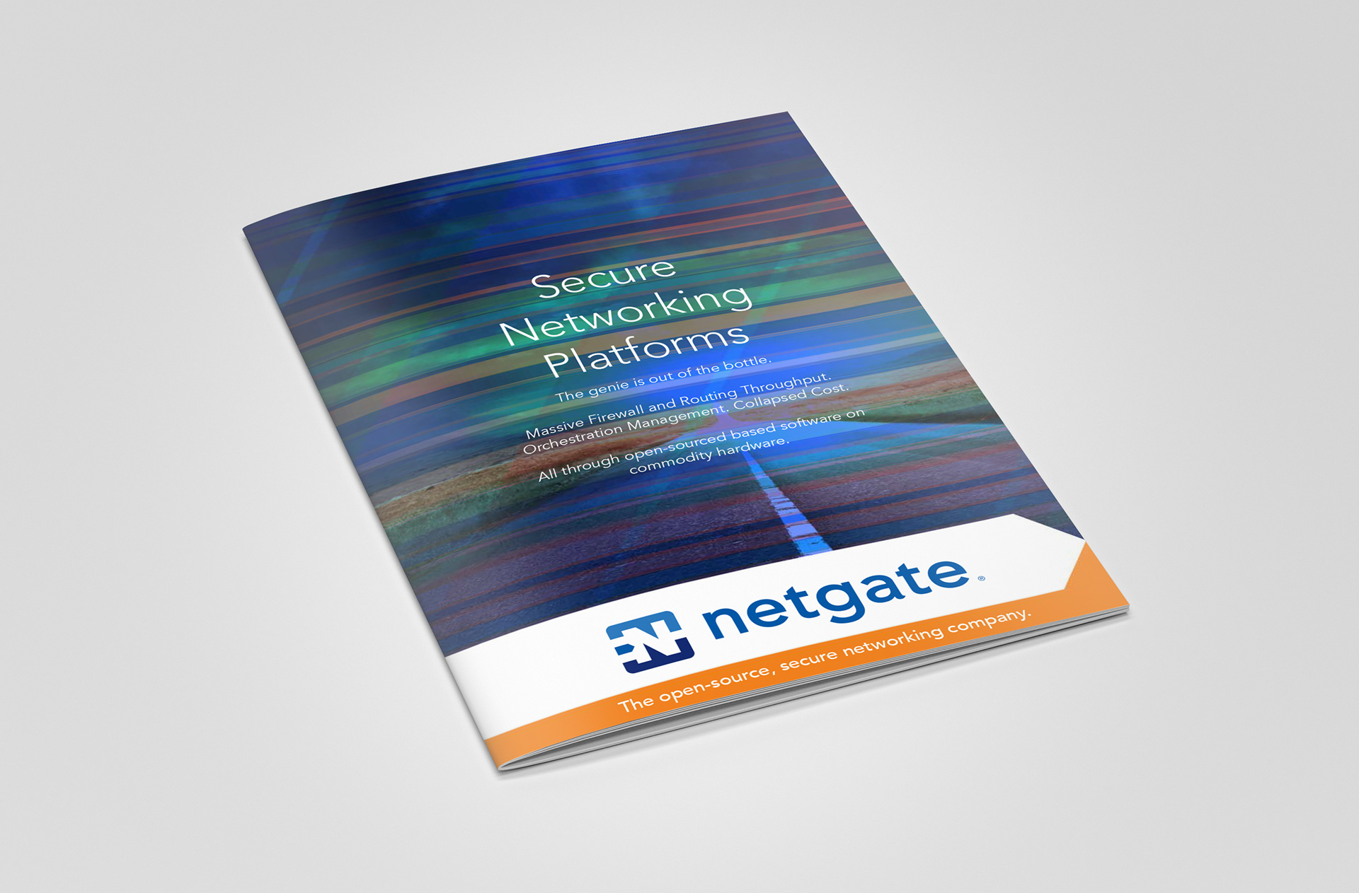
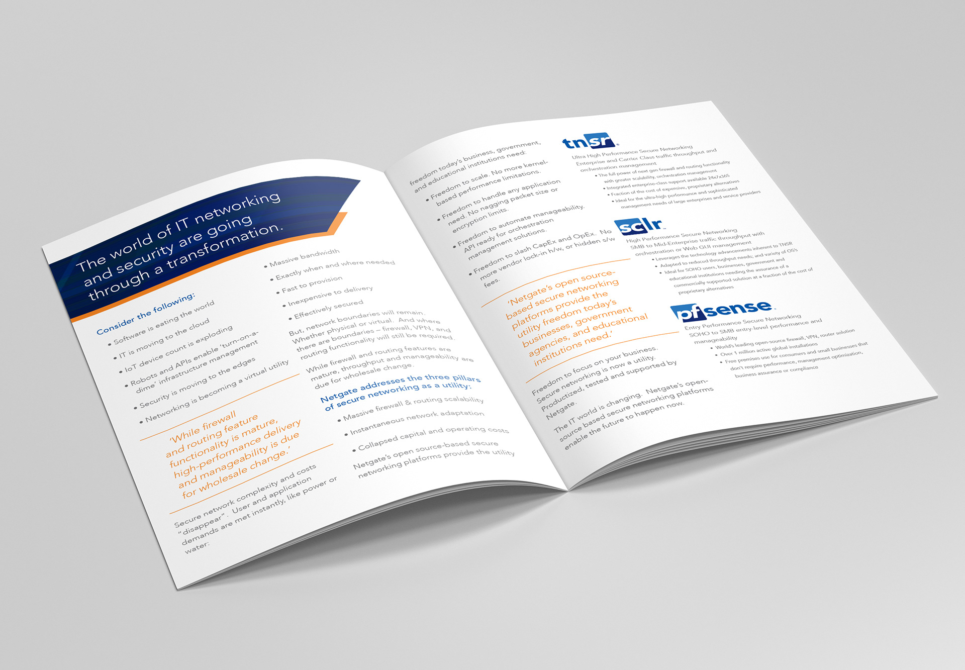
Product Brochure