a closer look at the process of rebranding for BerriHealth.
From the start
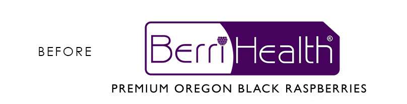
Steve Dunfield, the owner and president of Berrihealth, wanted a new take on the logo the company has had since its beginning in 2006. Soliciting proposals from several agencies close to home in Oregon, and a small firm in Oklahoma, Dunfield was looking for the right combination of creativity, communication, and responsiveness. After a few phone calls and online conversations, He decided to trust the out-of-town firm. We are glad he did.
Research
The team at BerriHealth already had a good amount of research, but we wanted more of an internal vision of what BerriHealth was about. We asked Steve and his team to complete an IDQ, an in-depth questionnaire that helps us learn about your company. In the meanwhile, our team was researching competition and the berry market. One of the things we learned from the IDQ was that the principles wanted to explore the option of salvaging the equity they had in their existing logo. We also discovered is they relied heavily on clinical sales and wanted to keep a more scientific feel.
Initial Concepts
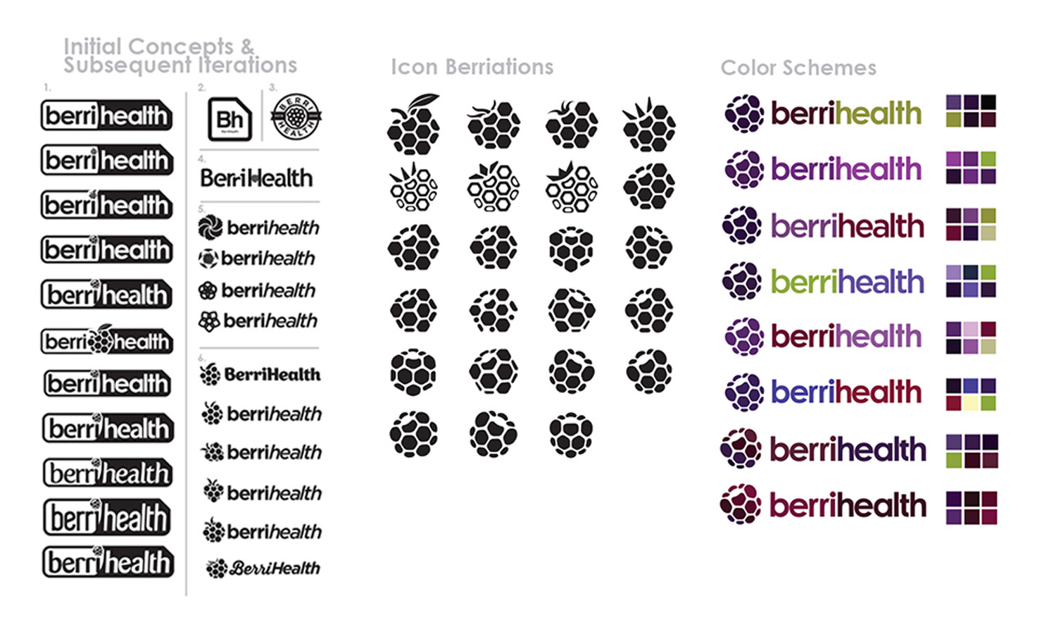
Several days of thumbnail sketches, and rough comps culminated in a wide variety of ideas. We narrowed them down to the best six and presented them to BerriHealth. We spent some time exploring options for several of the ideas. Slowly, we narrowed the choice down to two concepts. Either the company would keep the established “bent rectangle” and update the old look, or they would transfer that equity into a fresh new brand with new energy and life.
A New Direction
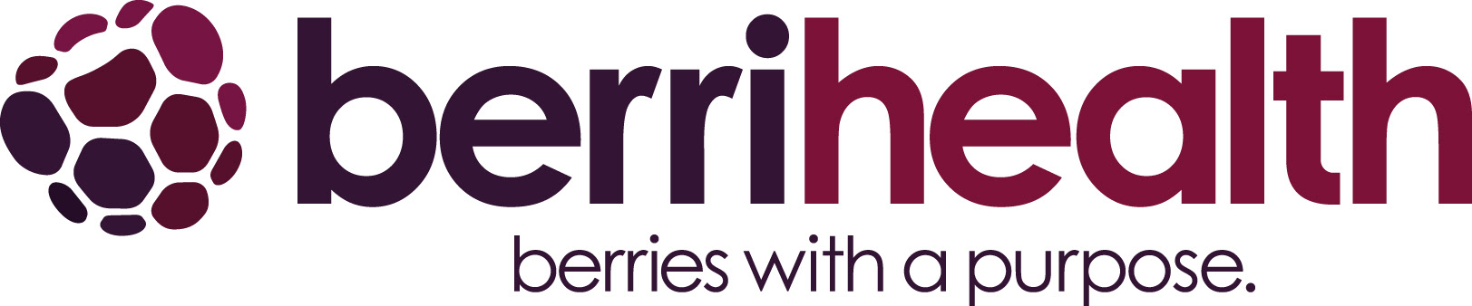
The berry in concept six was the element that sparked new life into the brand. Steve was excited about the subtle hexagons that make the berry and hint at the science behind the company’s foundation. Brian, Steve’s son and BerriHealth’s Vice President, was happy with the simplicity and boldness of a modern icon. We didn’t stop there, we went on to do several more variations on the berry itself. We looked at angle, shape of druplets, stems, implied dimensions, nothing was off limits. We regularly screen shared my computer while we brainstormed possibilities for the berry.
Color Me Happy
After some debate, and a consensus on the mark itself, our next task was to choose the color scheme for this new brand. Color is often a favorite part of the process, its visually satisfying, changes are obvious and come quickly. But without a strong black and white foundation, picking colors can be difficult and frustrating. A logo must work in black and white first, and color can’t fix a logo. But I’ll admit, color schemes are fun. Each round of color schemes we got closer to landing it. Meanwhile we were still solving some type issues.
“After looking at a few different designers for rebranding and redoing our packaging, we decided to choose Mark and The Brand Fix. His ability to communicate clearly and effectively and have a clear process for getting our design work done was one of the main reasons why, and Mark more than delivered in working with us as a team to accomplish our goals. Mark was able to use his design skills to transform rough, vague thoughts in our heads into a graphical mark that we are very pleased with. Mark is excellent at working with you to get designs where you want them to be. He never makes you feel like you are on the clock and is very generous with his time and effort. Mark is also good at identifying sticking points in the design process and gives input and ideas to keep things moving.“
- Brian Dunfield, BerriHealth